Design
A brand and digital platform concept designed to give musicians in Boston a simple, no-stress way to find where to play tonight.
Boston has a thriving but fragmented open mic scene. Event information is scattered across Instagram posts, venue websites, newsletters, and informal spreadsheets, making it genuinely difficult for musicians to find where to play. Boston Open Mic is a brand and digital platform concept designed to solve that problem, connecting musicians with venues and giving them clear, consistent information about open mic nights across the city.
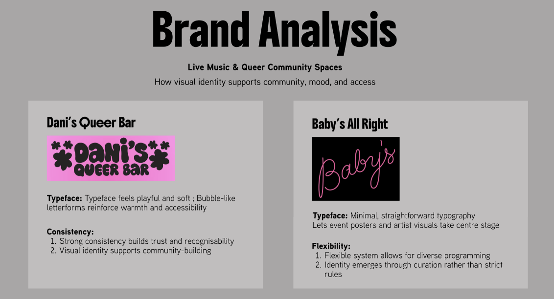
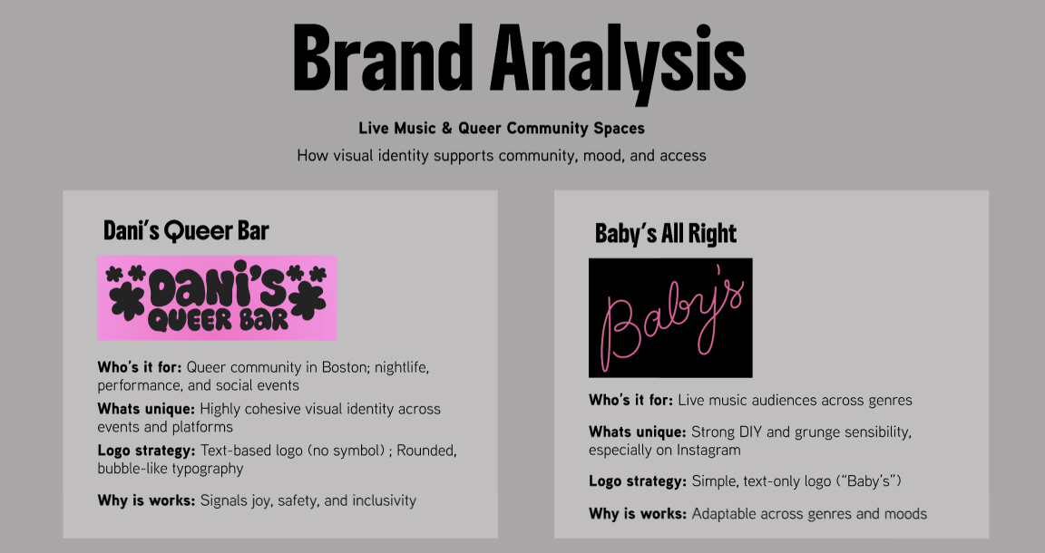
I started with brand analysis, studying how live music and queer community spaces like Dani's Queer Bar and Baby's All Right use visual identity to signal warmth, inclusivity, and accessibility. I built Pinterest mood boards to explore DIY, grunge, and scrapbook-inspired aesthetics, then developed a full visual system including color palette, type hierarchy (Boldonse for headers, Aaux Next for body), and logo.
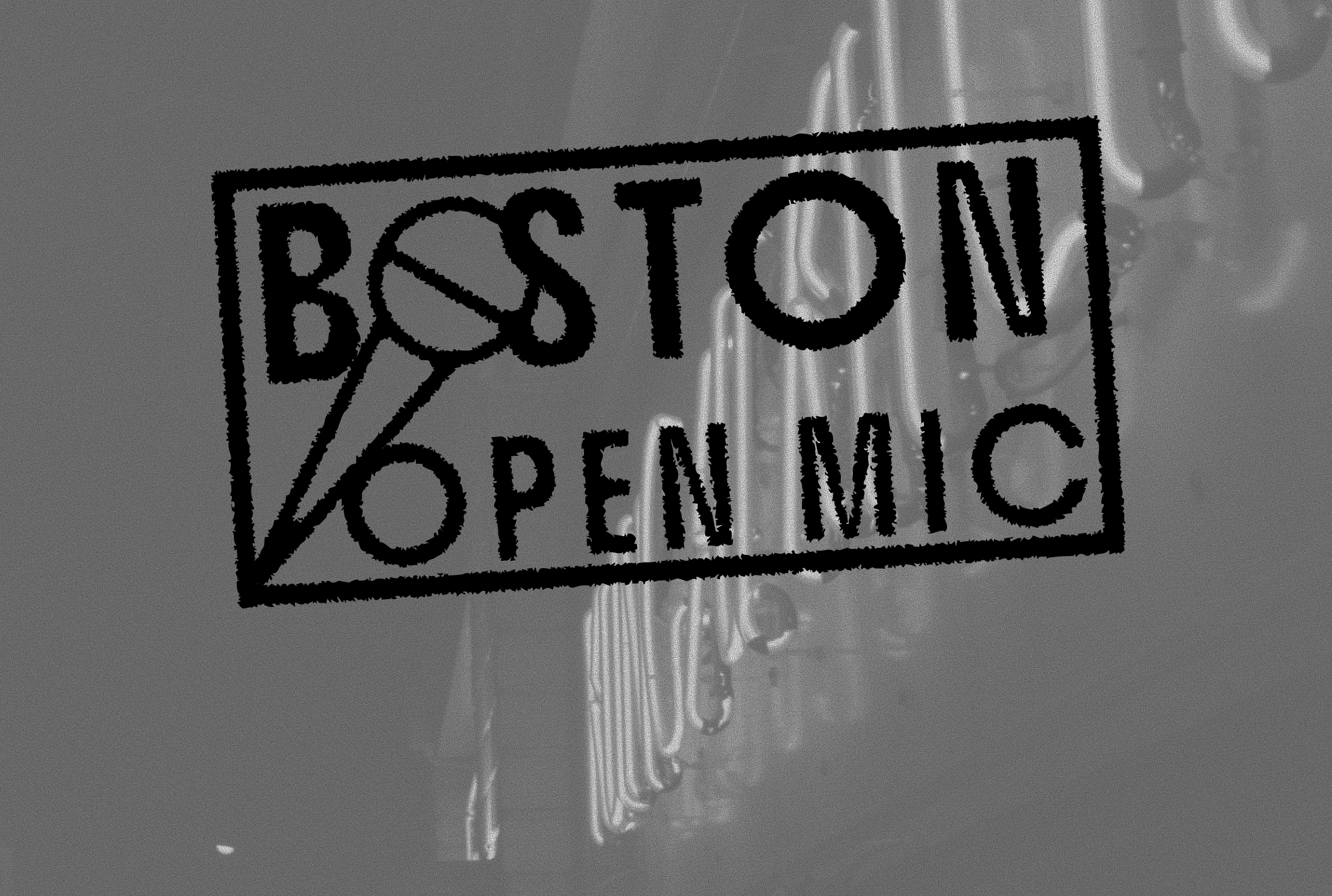
The final logo intentionally resembles a venue entry stamp, imperfect, handmade, and rooted in the feeling of local community. From there I moved into information architecture, wireframe sketches, and high-fidelity designs for both a website and a phone app in Figma. I simplified the color system as I moved into interface design, working with greens, greys, and black to keep the interface readable while preserving the DIY aesthetic.
The core function of the platform is the Open Mic Finder, which lets users filter venues by neighborhood and day of the week. Most navigation paths lead back to this tool, since discovering venues quickly is what the user actually needs.
This project came directly from my own experience organizing and attending open mics. I know how fragmented the information is and how much easier it could be. Designing the logo was one of my favorite parts. It almost resembles a stamp you might get at the door of a small venue, which felt right for what the brand is trying to do. Seeing the branding carry through into the interface helped me understand how visual identity and UX work together to create something that feels coherent and intentional.